
About the project
Wyden Educacional is an educational company with several branches on Brazil. This is a project where main goal is improving the acquisition journey, through a new landing page focused on customers persona.
Wyden Educacional
Discovery
UI Prototyping
With the advance in e-learning, many students have an opportunity to learn a new career at home. And many potential customers choose a college based on this benefit.
One of my challenges on Wyden was to develop a way to persuade these customers to enroll in a course, shortening the user journey.
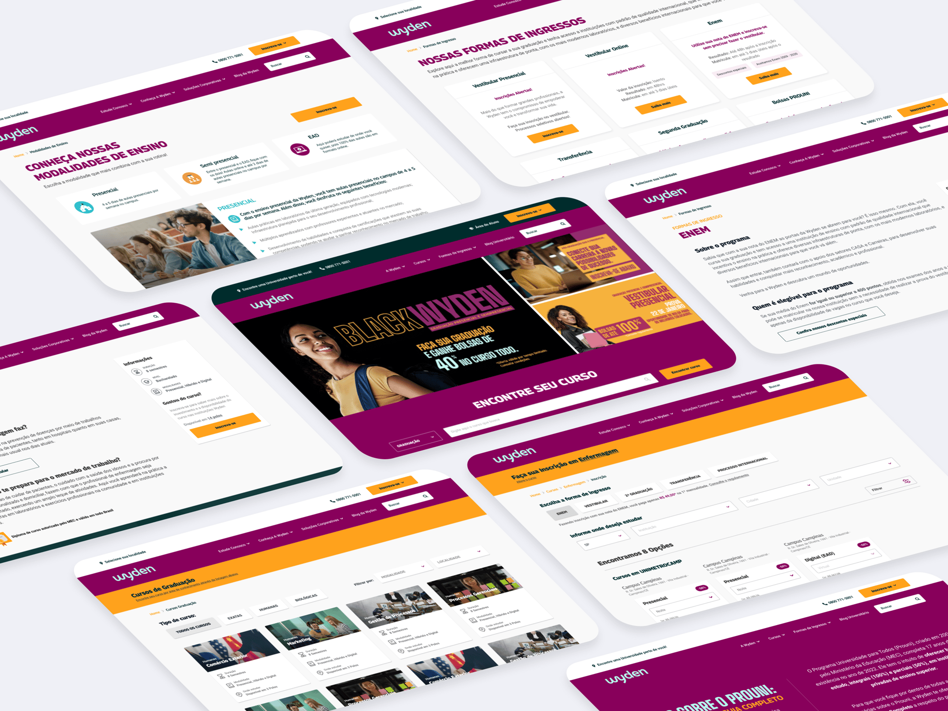
The old website had a complex information hierarchy. If a student was looking for a specific course, it was necessary to choose a state, an institution, and a department.
Then, the user would be led to another landing page according to the selected institution.
This hierarchy has brought some maintenance issues over the years. At the time I started this project, they had almost 800 URLs. Most of them were related to duplicated information from local institutions.
Also, the website had a lot of inconsistent pages, because of branding problems. Some pages had an old logo, with a blue and white UI. Other pages had the new branding applied.
Context
Problem
Research
To understand the company's persona, we reached out to an internal database, which had answers from a previous survey.
Through this survey, we could realize how our students choose an institution and a course to enroll in.
This information helped us a lot in the ideation of the new website.
You can see below the answer comparison between Wyden and Estacio students:
Top 3 answers
Easy access (35,1%)
Free admission (20,3%)
Scholarship (15,4%)
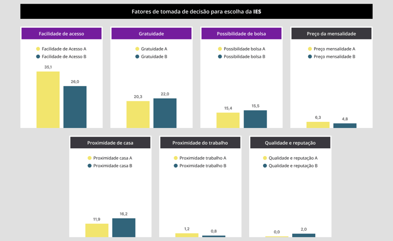
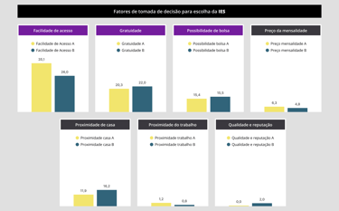
Which were the criteria to study at Wyden?
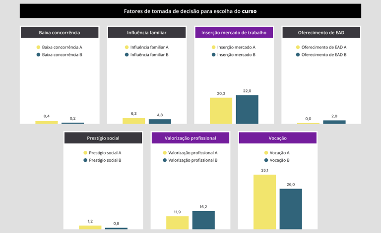
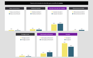
Which were the criteria to enroll in a course at Wyden?
Top 3 answers
Vocation (35,1%)
Facility to find a job (20,3%)
Professional valorization(11,9%)
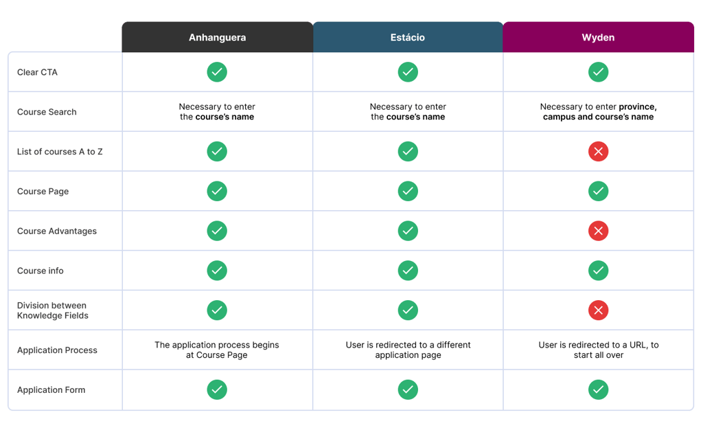
Benchmarking
One of the best ways to learn the best practices is by watching what our competitors are doing. We selected two main educational companies, and we compared our acquisition approaches.
The selected competitors were: Anhanguera and Estacio.
Hierarchy Information
Then we decided to redefine the website hierarchy. Our goal was to provide a better experience for the admission process. So, we had to manage several ways to lead the user to the Registration Page/Application Form.
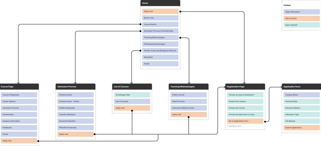
Solution
You can check out the prototype below.
In this project, I design the pages that would help us to achieve our main goal.
One of the attention points was to design the UI focused on the new branding. Also, every page was created with components, so, if necessary, the development team could create a whole new page.
Got a partnership idea, or a project you need help with? Shoot me a line and let's talk.